
With 2020 fast approaching, I am excited to go into my eighth year of managing Tour de Cincinnati with some fresh content and new adventures. This year I intend to launch a shop that I think you all will love.
As I celebrate seven years creating, designing, photographing, writing, and growing under the Tour de Cincinnati umbrella, I have been working on a brand redesign.
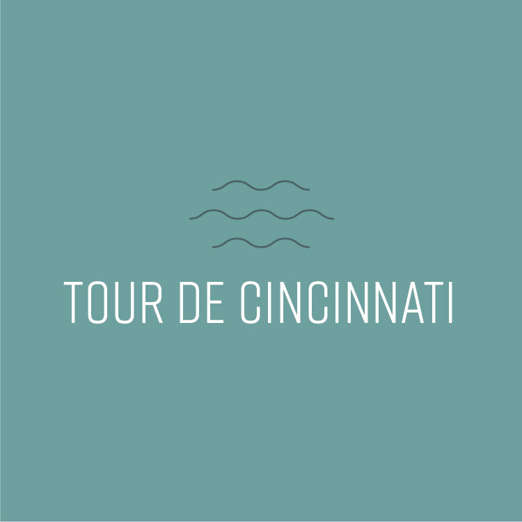
My goal was to create a minimalist logo that conveyed Cincinnati and what Tour de Cincinnati is—website, resource, all things Cincinnati—while using responsive line art and type that can ultimately each stand on their own.
There are several elements that are inherent to the very fabric of Cincinnati that I love but did not use, such as Art Deco design, maps, and landmarks. Instead, I know that this minimalist design succeeds and communicates “Cincinnati” in so many ways. From seven hills (and seven years!), the river, spaghetti noodles (you know I couldn’t resist a nod to our chili), progression and movement, plus a visual representation of lines of text and lists, this line art is so simple yet so effective in communicating exactly what I wanted in a rebrand.
While I absolutely loved the Cincinnati map outline in the original logo (and wanting to normalize that shape when people regularly asked, “Is that Alaska?”), after hours of sketching, researching, and brainstorming how to achieve all of the above, I believe I have reached a solution that is visually appealing and an excellent representation of what Tour de Cincinnati is and will continue expanding to be.
For a more complete look at Tour de Cincinnati’s new brand, check out this post on Instagram.


Comments are closed.